2026 Paint Trends
Westrose Weighs in on the Colours Defining the Year Ahead
As we step into a new year, paint colours are often one of the first design cues to signal what’s coming next. Colour-of-the-year announcements and annual paint trend forecasts don’t just point to what’s fashionable, they offer a snapshot of how we’re feeling, what we’re craving, and how we want our homes and workplaces to function right now.
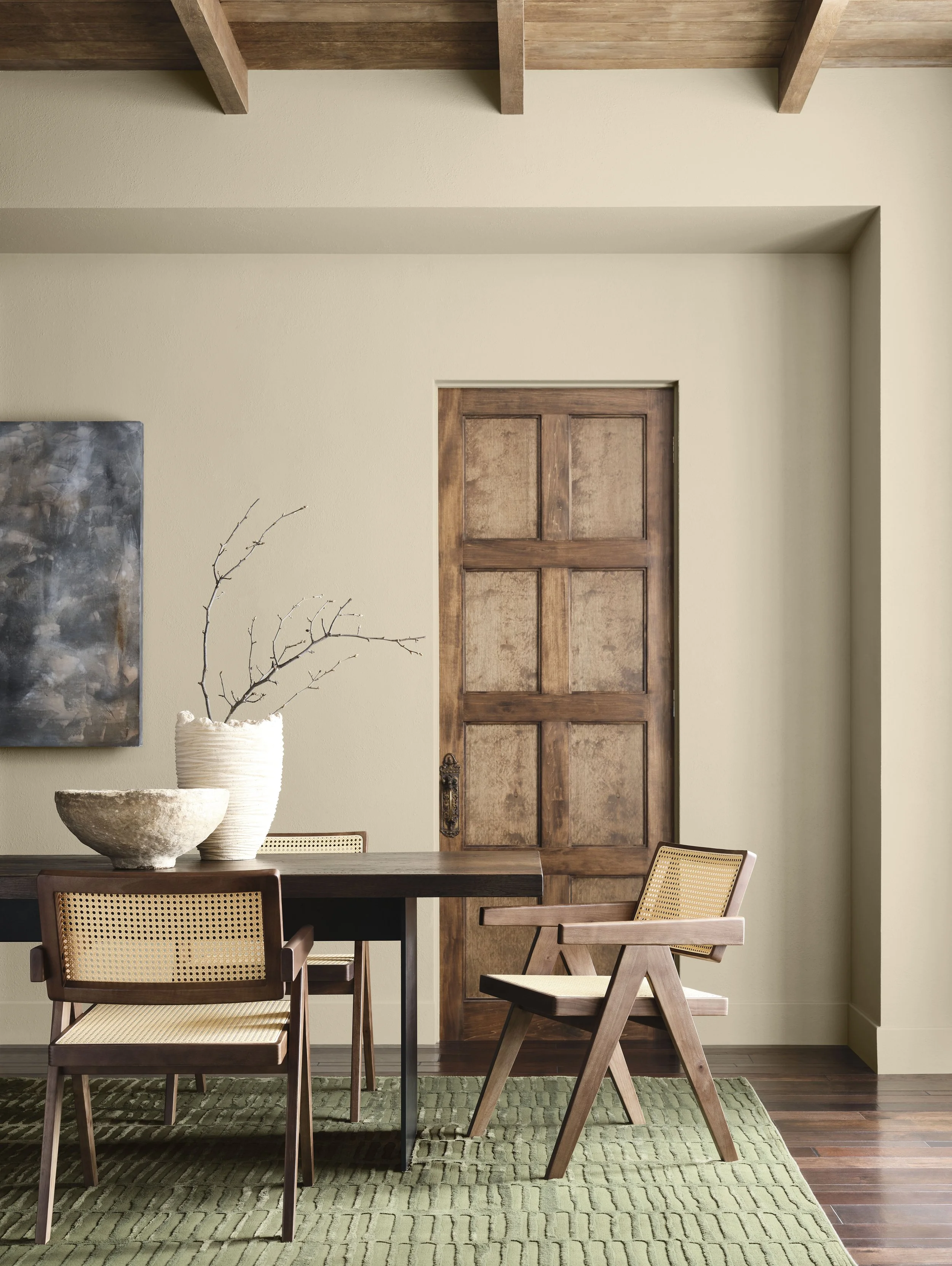
Comfort, warmth, grounding, and personal connection are emerging themes for 2026, reflected in a noticeable shift toward deeper tones, earthy neutrals, and colours inspired by nature.
Below is a closer look at some of the paint colours shaping 2026, paired with Westrose’s perspective on how these shades translate from swatch to real-life spaces.
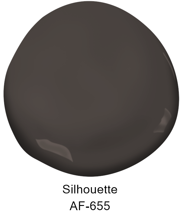
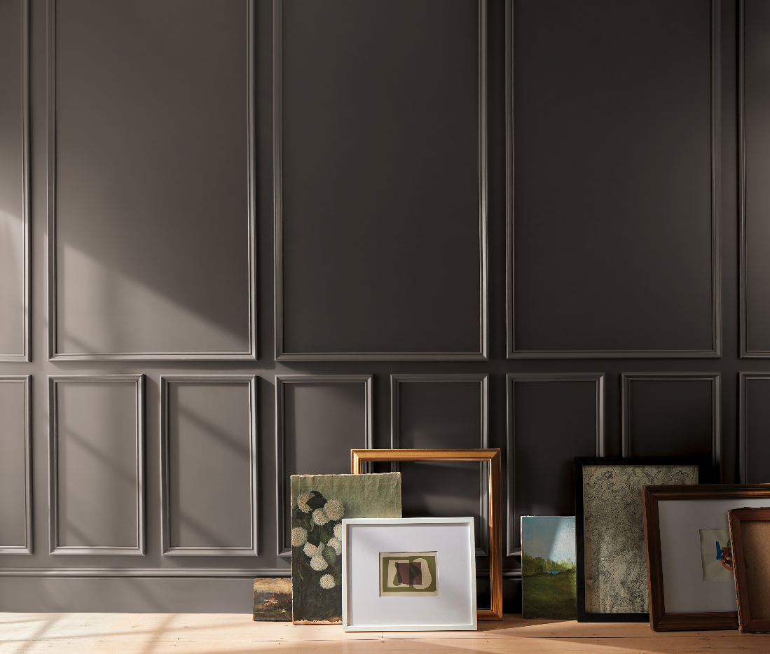
Benjamin Moore, Silhouette
An alluring mix of rich espresso hues with subtle notes of charcoal, Silhouette taps into the growing appetite for deeper, moodier interiors that still read as refined rather than heavy.
The Westrose Verdict
1. Do we like it?
Yes. The rich espresso and charcoal tones feel refined and moody without being too heavy.
2. Where would this colour work best in a home?
A powder room or dining room. Deep shades create drama and impact, and these more contained spaces allow for bold colour without overwhelming the home — making them ideal, low-commitment places to experiment.
3. Does it have longevity beyond 2026?
Yes. Its rich espresso base and subtle charcoal undertones are classic rather than trendy, making it timeless and versatile across a range of interiors.
Westrose Rating: ★★★★★ (5)
Design note: One of our favourites and already slated for an upcoming powder room project.

Get Your Hands On Our Free
Home Buyers Checklist!

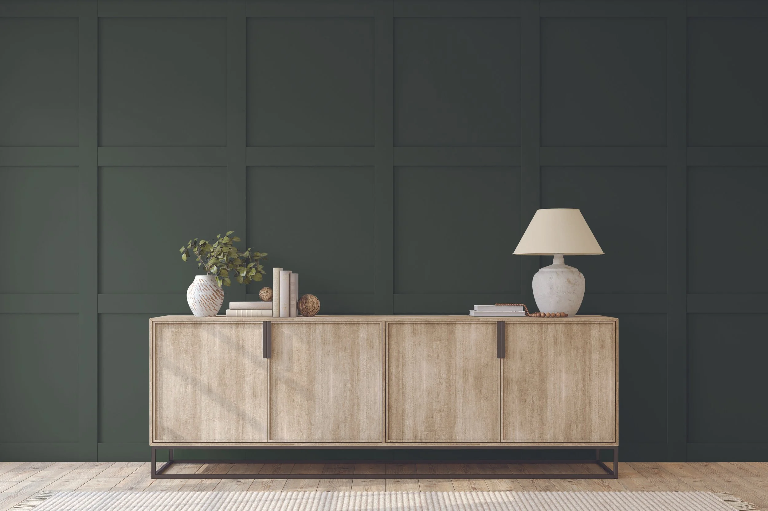
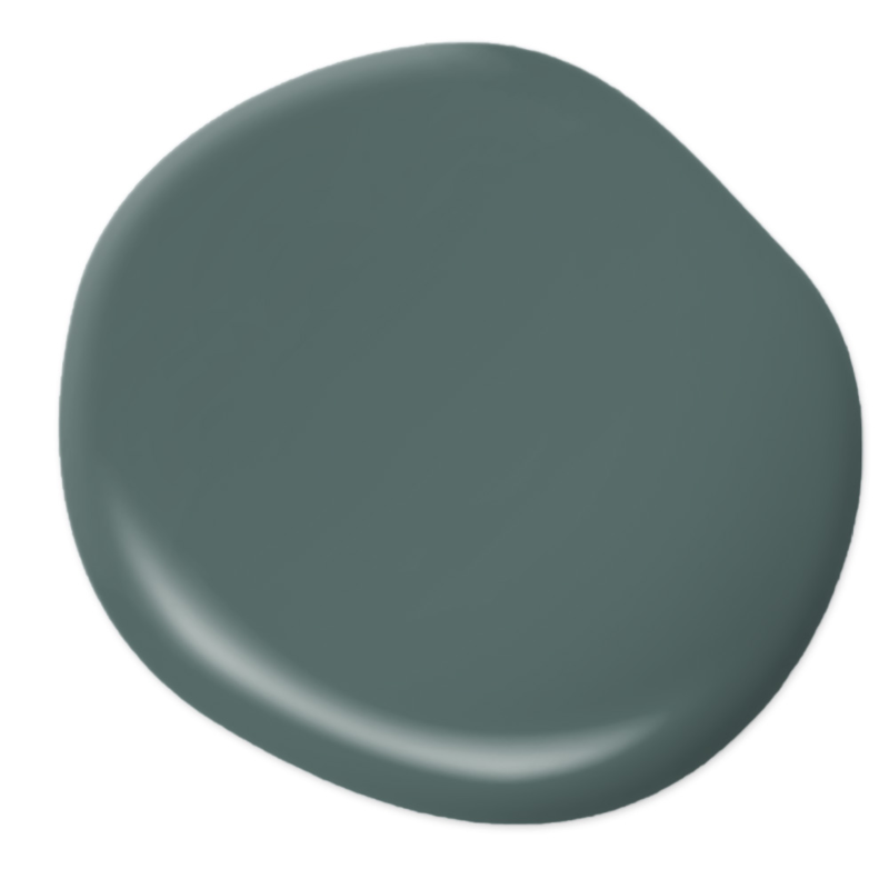
BeautiTone, Muse
Softly complex and quietly confident, Muse reads as a refined earthy neutral with a calming presence. Its warmth gives it approachability, while its depth keeps it from feeling flat or expected. This is a colour that doesn’t demand attention, but rewards a closer look; it’s the kind of shade that settles into a space and lets the architecture and furnishings take the lead.
The Westrose Verdict
1. Do we like it?
Yes. Its refined, earthy neutrality and quiet depth create a calming, balanced presence.
2. Where would this colour work best in a home?
A home office or millwork such as kitchen cabinetry or panelled walls. Green is naturally soothing, making it ideal for focused workspaces, while its depth highlights profiles and joinery details, allowing proportions and craftsmanship to shine.
3. Does it have longevity beyond 2026?
Yes. Greens found in nature are timeless, and this shade’s earthy balance gives it lasting appeal rather than trend-driven impact.
Westrose Rating: ★★★★★ (5)
Behr, Hidden Gem
A smoky jade with a muted, mineral quality, Hidden Gem feels rich without being overpowering. There’s a softness to the colour that keeps it from reading jewel-toned, giving it a calm, sophisticated presence rather than high drama. It’s a shade that brings depth and character to a space while remaining surprisingly versatile.
The Westrose Verdict
1. Do we like it?
It’s not quite for us. The jade tone lacks the warmth and familiarity we tend to gravitate toward, and the teal reads slightly artificial rather than organic.
2. Where would this colour work best in a home?
A child’s bedroom, paired with brighter accents. Kids’ spaces are full of books, art, and toys, so this shade can act as a strong backdrop that holds up well against visual variety.
3. Does it have longevity beyond 2026?
Potentially. Like any colour, longevity depends on what it’s paired with and how it’s used.
Westrose Rating: ★★★ (3)

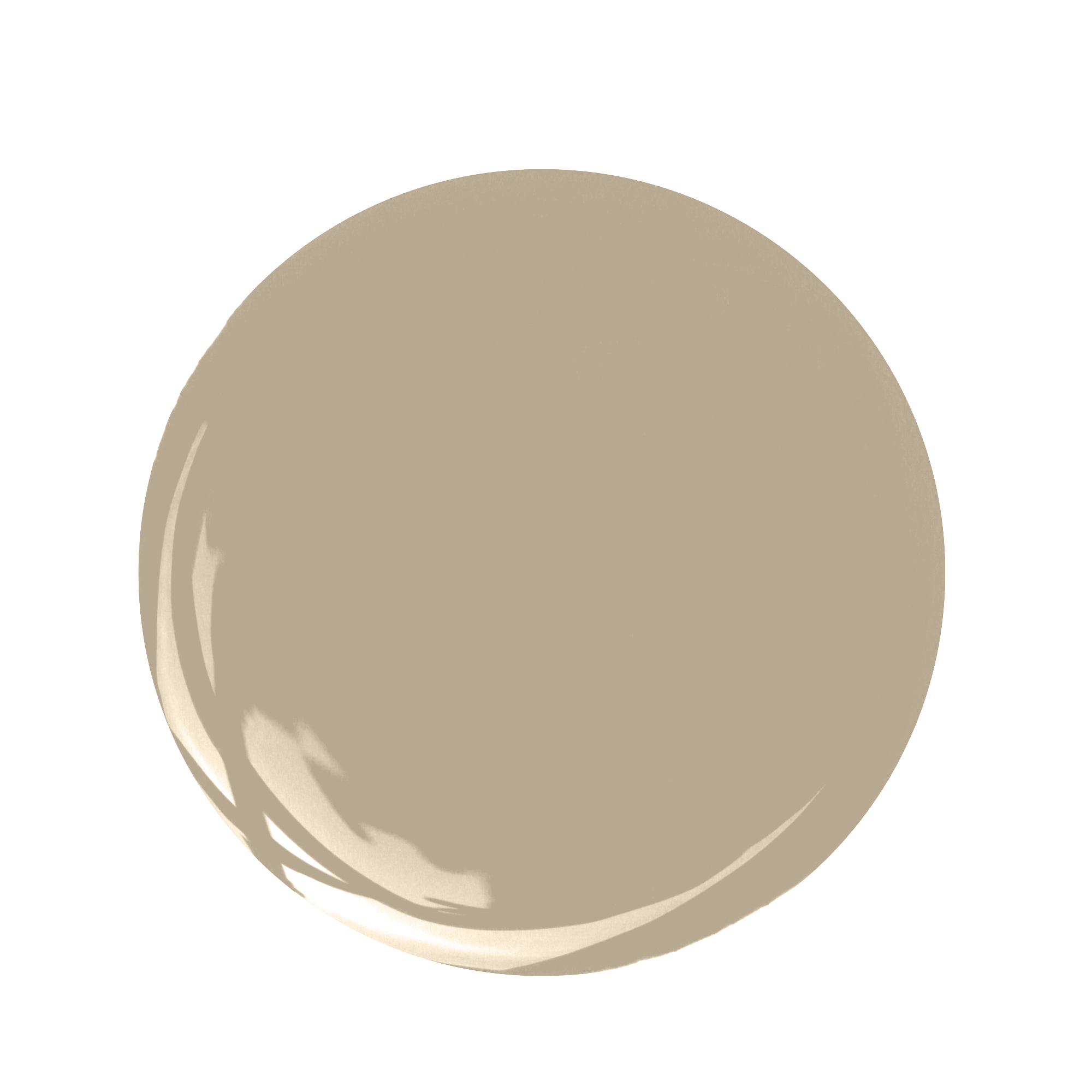
Sherwin Williams, Universal Khaki
Quietly familiar and intentionally understated, Universal Khaki is an earthy mid-tone neutral that feels rooted rather than reactive. Neither too warm nor too cool, it sits comfortably in the background, creating a sense of calm and continuity. This is a colour that prioritizes livability , it is a steady foundation that supports a space without competing for attention.
The Westrose Verdict
1. Do we like it?
Not particularly. This shade reads slightly pink, and khaki tones with pink undertones can feel less natural in a space.
2. Where would this colour work best in a home?
A bedroom, where its muted neutrality can create a soft, cocooning effect that feels calm and grounded.
3. Does it have longevity beyond 2026?
Yes. Beige tones mimic sand, stone, and other natural materials — making them universally appealing and easy to live with long-term.
Westrose Rating: ★★★ (3)
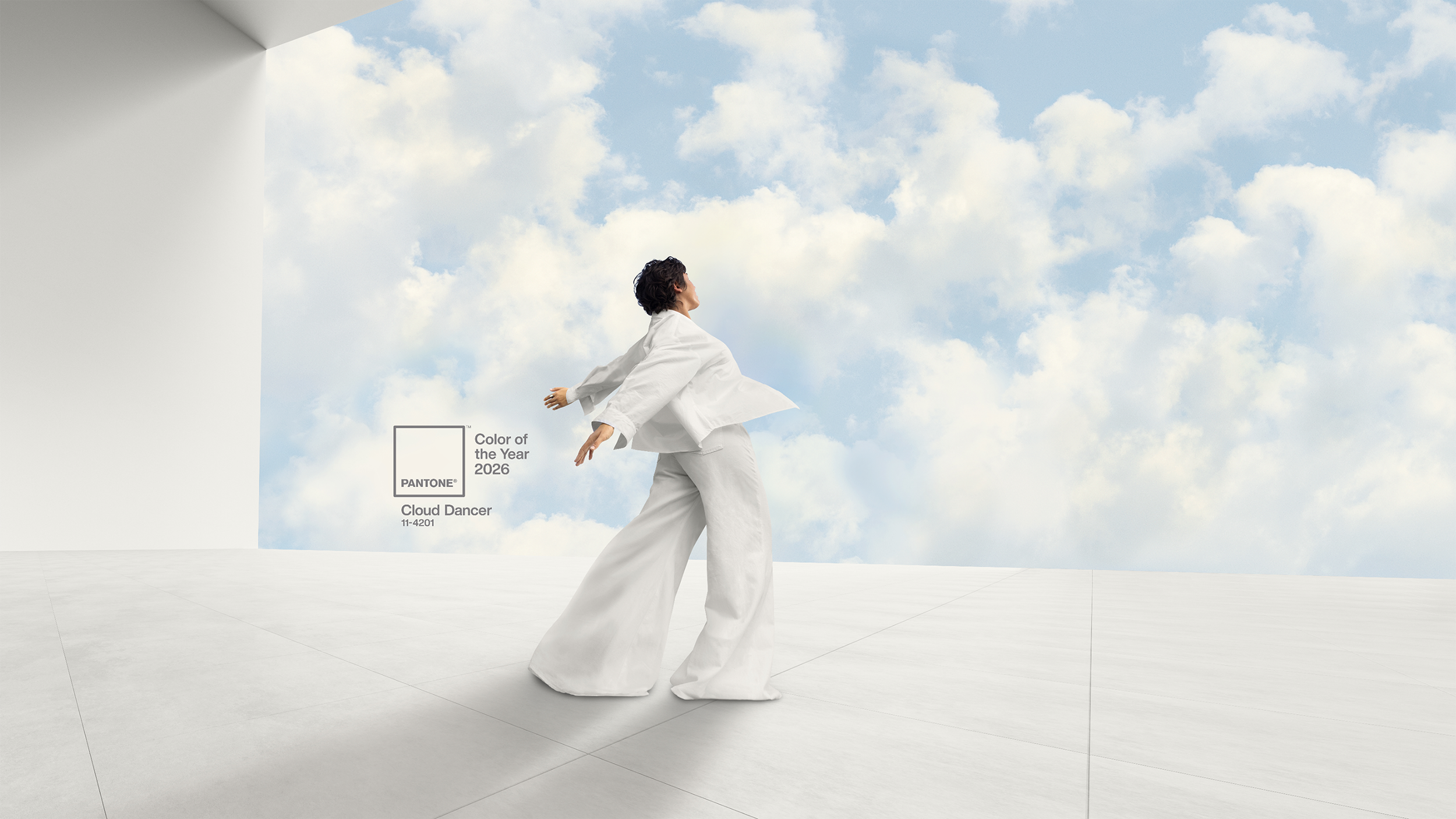
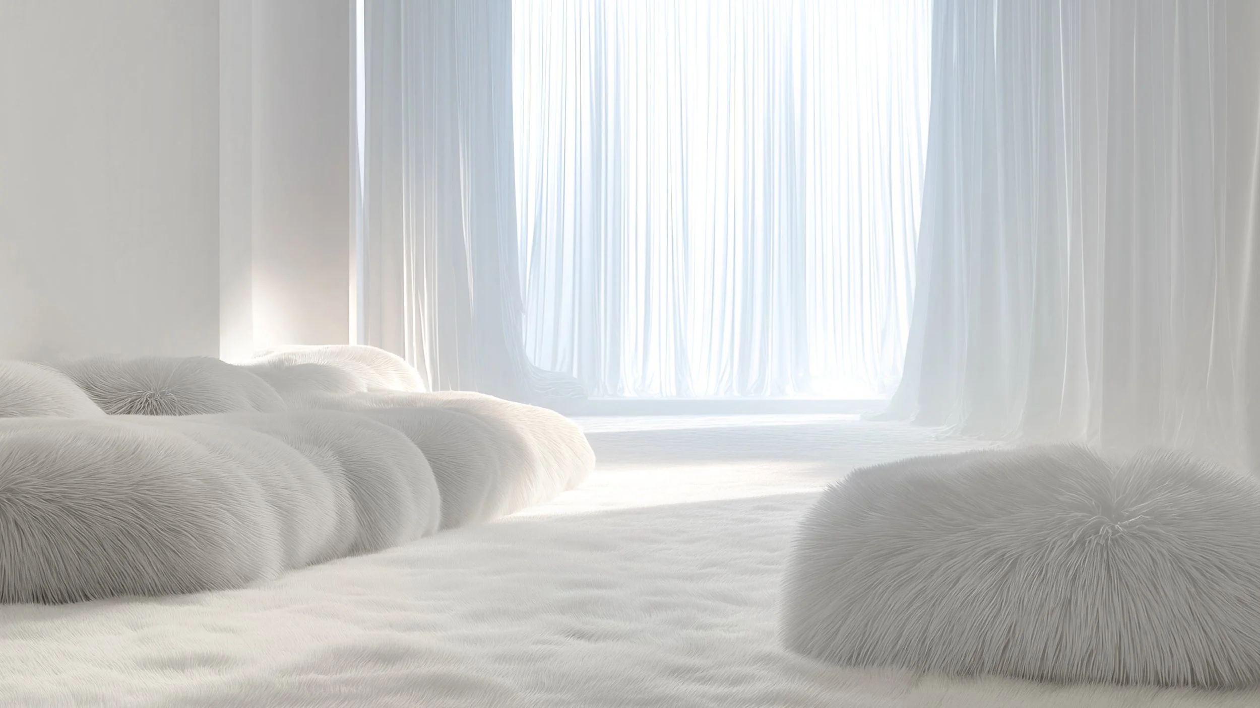
Pantone Colour of the Year 2026 — Cloud Dancer
Before wrapping up our 2026 paint roundup, there’s one colour announcement that deserves its own moment. Unlike the paint brands above, Pantone’s Colour of the Year isn’t tied to a specific product—it’s an idea meant to capture a broader cultural mood. This year’s choice, Cloud Dancer, arrived quietly and unexpectedly, sparking plenty of conversation within the design industry.
The Westrose Verdict
1. Initial reaction?
Surprise. It didn’t feel believable at first, and needed to be seen in context to understand the intention behind the choice.
2. Where, if anywhere, does Cloud Dancer influence interiors?
As a versatile white for walls, trim, cabinetry, and ceilings. It highlights textures and other colours while keeping spaces light and inviting.
3. Is this a lasting shift or a moment in time?
It feels like part of a longer move toward calm, timeless interiors. As a neutral backdrop, it works well with layered materials and textures, giving it relevance beyond a single year.
Westrose Rating: ★★★★ (4)
Final Thoughts
Looking across these 2026 paint colours of the year, a clear pattern emerges: this is less about chasing novelty and more about creating spaces that feel comforting, grounded, and emotionally resonant. From deep espresso tones and moody, nature-inspired greens to versatile neutrals and a softly confident white, this year’s paint trends point toward interiors that feel intentionally layered rather than purely decorative. The colours that resonate aren’t necessarily the loudest, they’re the ones that support how we live, work, and unwind at home, making longevity and adaptability more important than ever. These 2026 paint trends offer insight into how colour is shaping interior design and home renovation decisions in the year ahead prioritizing balance, warmth, and a sense of personal connection.
Considering a Renovation, New Build, or Commercial Project in 2026?
If a renovation, new build, or commercial project is on your 2026 to-do list, now is the perfect time to start thinking about how colour can shape the way a space feels and functions. From private residences to thoughtfully designed commercial environments, early paint and colour decisions play a meaningful role in setting the tone for how a space is experienced.
Wherever your preferences fall on the colour wheel, the Westrose design team brings care, intention, and design-forward thinking to create spaces that balance aesthetics, functionality, and longevity. Thoughtful decisions made early can make all the difference.
HAPPY NEW YEAR!
Connect with Westrose and explore what’s possible.
Click below and let’s talk!